

To kick off my updated product photography portfolio, I wanted to play around with a fruit theme and any kind of gooey, liquid product. I picked out the Raspberry Fizz scented body scrub from Tree Hut; a shower staple! I was really excited to play around with the texture of a body scrub for some epic swatches and model demos. Trust that this one got messy, though! I also wanted to include fruit as a prop since it’s one of my favorite ways to show off a products ingredients or scent. Raspberries weren’t a fruit that I’ve played around with yet and I liked the idea of a smaller berry to style a scene.
I started out with the studio images of just the product. I wanted to emulate an ecommerce ad and social media essentials. I detailed 4 different concepts on my shot list/mood board.
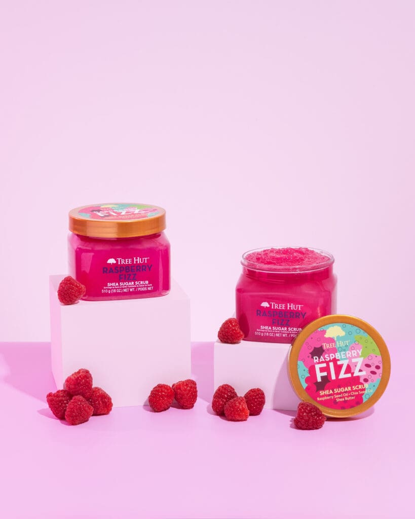
1. Styled Scene Hero Image
My initial concept was a very simplistic hero image on a solid backdrop with risers featured a closed and opened product. I love including duplicated of the same product for ecommerce images. It’s good for your customer to see the packaging as well as contents inside. With one open lid, I could prop up the cap to showcase the packaging even more.
When choosing the color scheme, I wanted to stick with a monochromatic look. I chose to color match the light pink text color from the jar to use as my background color. I felt like this pale shade really made the vibrant scrub pop.
While this set on it’s own is eye-catching, I wanted to test out some fruit props. To align with Tree Hut’s colorful and maximalist styling, I wanted to fill the scene with raspberries. This pop of a deeper shade helped to tie in the scrubs tone, too. My overall goal for styling these raspberries was to stack and balance the scene. Since I placed the cap on the right hand side, I wanted to be sure the left portion of the frame was equally as filled.
Overall, I think this is a stellar ecommerce shot. We’re showcasing the packaging and branding clearly while enticing the customer with the idea of this raspberry scent.
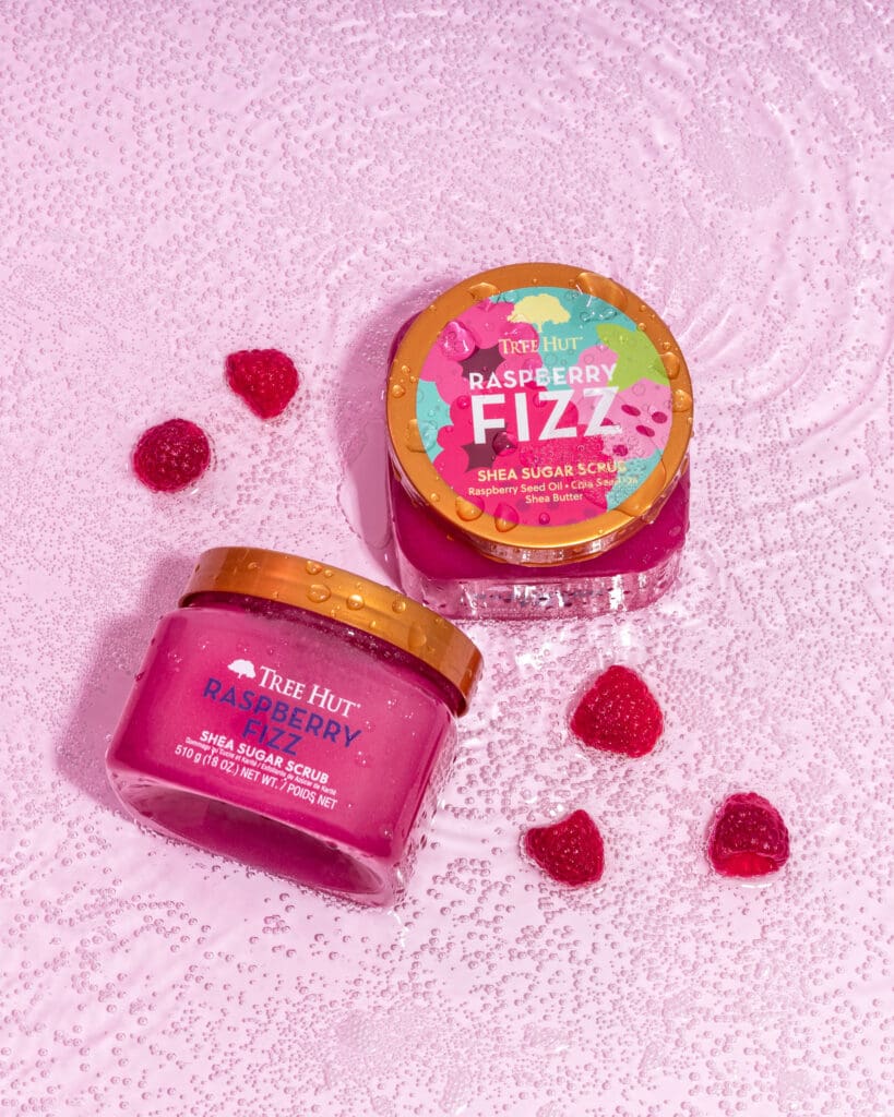
2. Styled Flay Lay Hero Image
My next goal was a unique social media image that leaned into the fizz description of this body scrub scent. I settled with a twist on the classic water concept. Since this is a shower product, I felt like a water scene was more than fitting. To incorporate the fizz, I added a liter of club soda to the water. These little bubbles definitely allude to a uniquely, fizzy shower experience. I haven’t seen anything like this before so I would consider it a scroll-stopping social media photo.
Because the scene was already looking quite busy, I didn’t want to highlight the product’s actual contents in this photo. A focus on the fizz was the overall goal of this shot. When styling, I decided to set one jar on it’s bottom with the cap facing the camera. I then placed the duplicate product on it’s side to position the front label towards the camera. This way, the image is featuring both labels and doesn’t feel redundant with 2 identical jars.
Lastly, I debated on incorporating a few raspberries. I loved the idea of the shot on it’s own, but I felt like it was missing something. I’ve always adored a fruit bath photo, so that’s exactly what I intended for. I placed a few raspberries in each of the empty spaces around the jars. This helped fill the frame and avoid too much blank space.
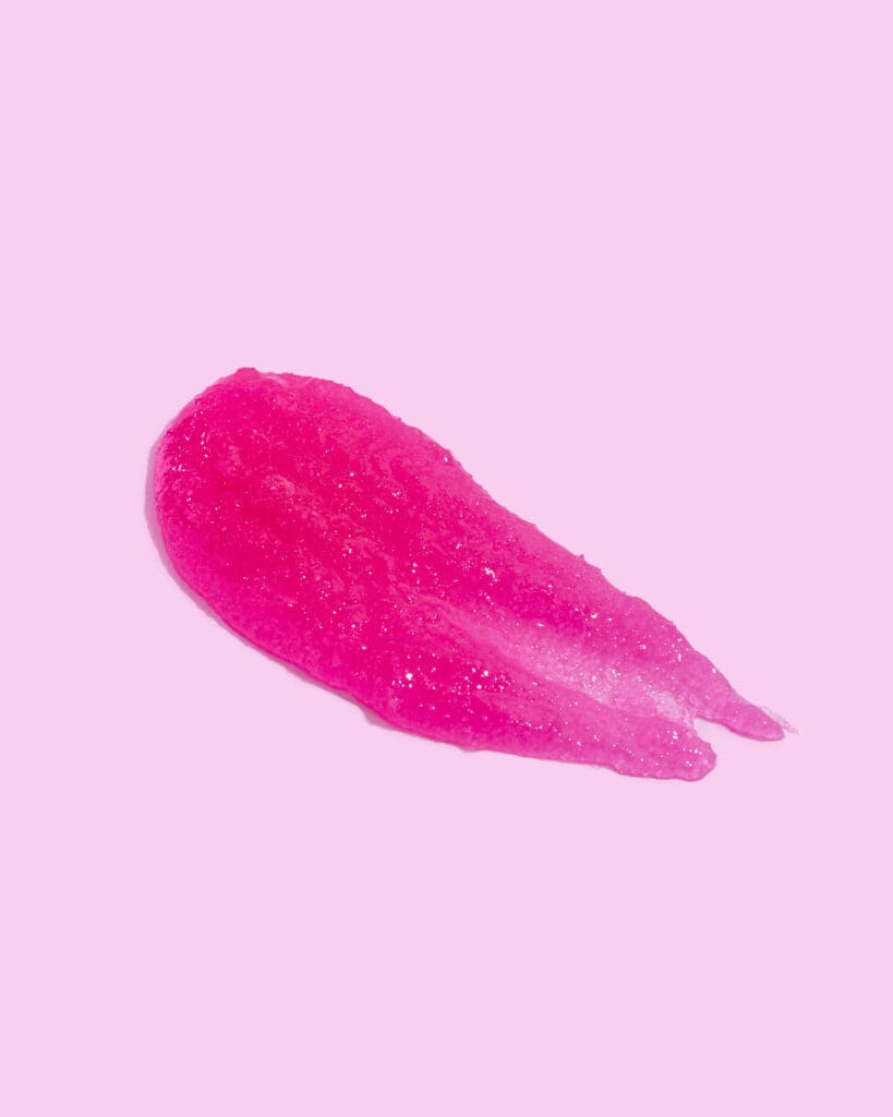
3. Product Swatch
Another product essential is the swatch. Customer’s want to see how the product lays and moves. This is necessary for ecommerce listings. Swatches are one of those things that are quite difficult to get exactly right. There isn’t much room for adjusting with certain products. I ended up needing completely reset with this one if something wasn’t laying perfectly.
The great news with products like this that have the same exact formula in differing scents and colors, is that we can easily use the same swatch and color match each one in post production. This same pink scrub can become purple, blue, or anything else you can imagine.
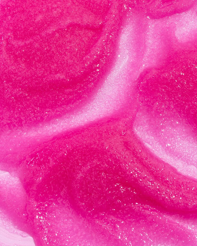
4. Texture Close Up
In addition to swatches, some products look great in a close up in texture image. Zooming in on the sugar crystals and mimicking movement through the scrub gives the best visual of what the product might feel like. A photo like this will help your online customer’s decipher the product’s texture.
Just like first product swatch, we can alter the colors on this texture as well. Meaning we have about 10 images created from 1.
Are you planning your next product campaign? Let’s connect! I’m a brand and product photographer based on the East Coast of the USA. I love working with beauty and lifestyle brands. Let’s connect!


Back to the blog